Introducing "Greenery" - Pantone Color of the Year

Introducing "Greenery", Pantone, the self-professed "Color Institute", declares at the 2017 "Color of the Year". So, what exactly is a "Color of the Year"? Since 2000, Pantone has chosen a specific color and hue (in this case "Pantone 15-0343") as a "symbolic color selection" or rather a "snapshot of what we see taking place in our global culture that serves as an expression of a mood and an attitude".
 After last year's 2016 colors of the year, "Rose Quartz" and "Serenity", "Greenery" comes as a fresh and revitalizing tone for the year - symbolizing an energetic new beginning. Perhaps the most obvious evocation for the color is nature itself - "greenery" omnipresent throughout the natural world - luscious foliage, deep pastures of grass, and wild forestry. Color experts at Pantone reflect, "Greenery is nature's neutral".
 Here, a bountiful table scape, is on display. Centerpiece arrangements act as runner - filled with green hydrangeas and white roses. A ceiling of delicate orchids in alternating green and white offers an immersive experience for guests. The setting is appropriately outdoors - amongst the living "greenery" of trees and the lawn. Natural wood accents in the plates and vase containers perfectly compliment the color palette.

Perhaps where the most striking example of the color trend is in fashion. Recent fashion houses such as Kenzo, Michael Kors, Zac Posen and others have used the color in vibrant prints ready on the runway for their 2017 lines. "Greenery" is definitely a "statement" color when it comes to apparel - it is best worn in a dramatic fashion or on a smaller scale in accessories such as watches, handbags, and shoes.
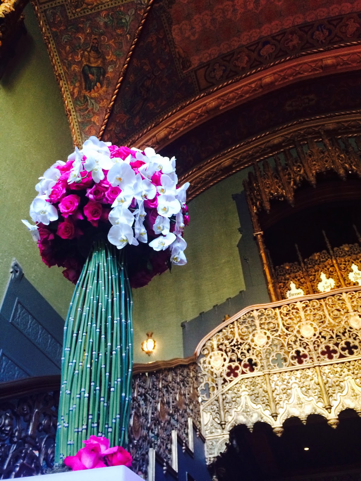
In the world of interior decorating, designers have started utilizing "greenery" to their advantage to bring a striking pop of color to spaces. Whether it is a monochromatic set of chairs or accent pillows and throw blankets, all eyes are on "green". When used with a neutral palette consisting of whites, black and wood furnishings, "greenery" does it's job of creating a stimulating visual effect.

The team at Elite Productions International has incorporated the color into it's own design house and showroom - using foliage and floral arrangements. Using modern chromatic gold and stark white, arrangements were used strategically to compliment the palette. Monstera leaves were used in combination with white hydrangeas for dramatic arrangements - while whimsical Granny Smith apples added a light and lively addition to the showroom.


For more information on Pantone Greenery and Elite Productions International, feel free to visit our website and social media platforms listed below.
Website Facebook Twitter Instagram Pinterest
Call Us Anytime or Drop By Our Showroom !
949.367.2900
Our Showroom is Located At
26072 Merit Circle #111
Laguna Hills, CA 92653
M - F 10AM - 5PM
Elite Productions International is an event design, planning, and management company located in Orange County, CA.


Comments
Post a Comment